Hey guys,
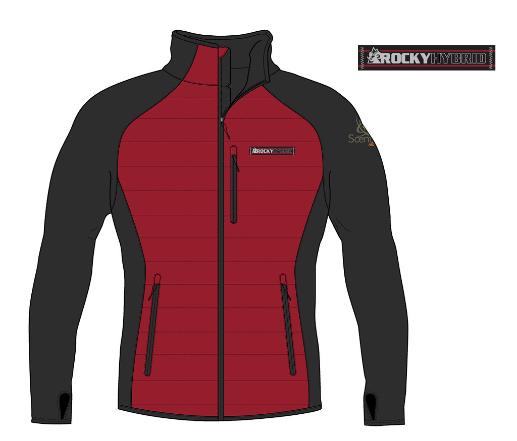
I design apparel for Rocky Brands.
I thought maybe I could get some feedback from a few of you.
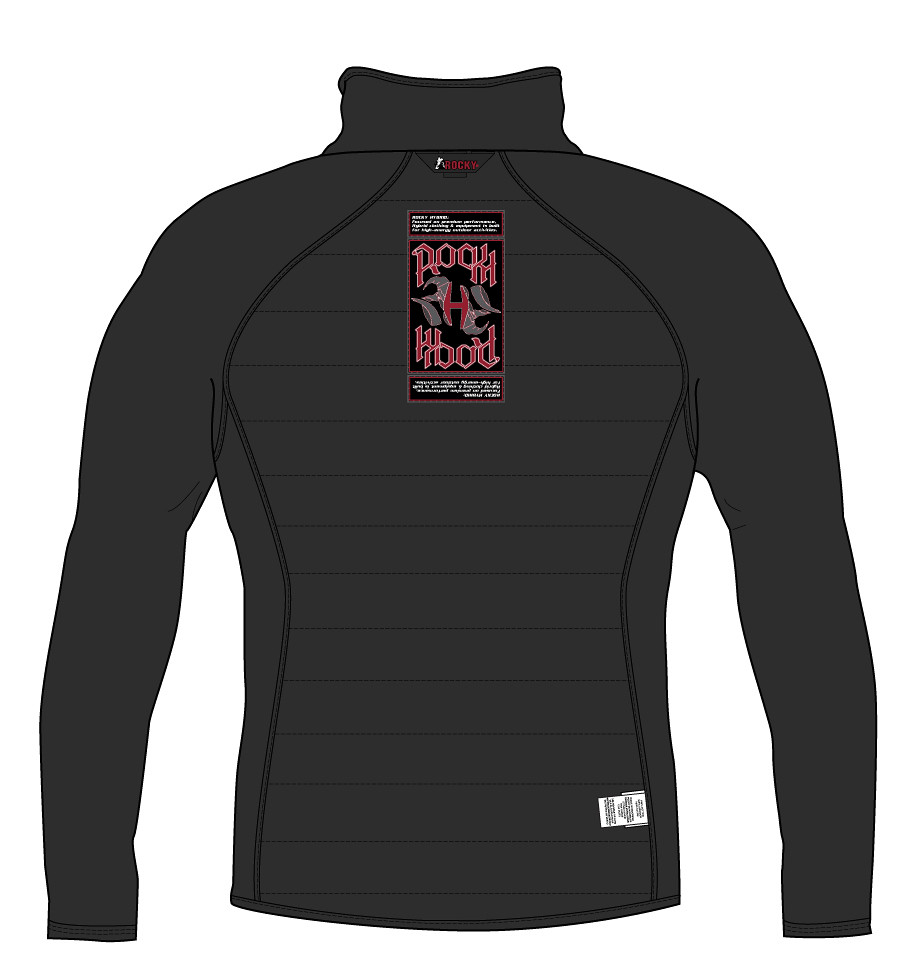
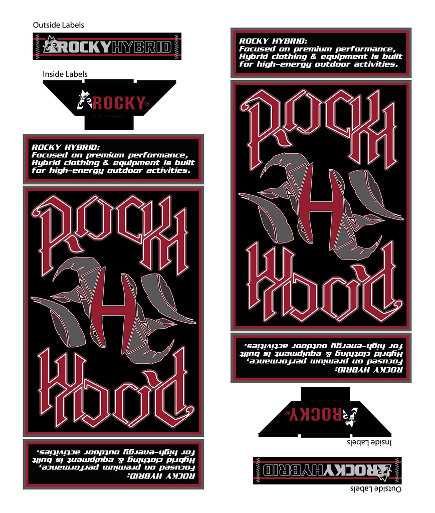
Im launching a new line of Hybrid Apparel and I wanted to do something fun for this launch. I came across this Murray/Hyperlite thread and now Im obsessed with the Ambigram. Ive been working on an inside label for the outerwear and Id like to get feedback on it. Does it read well or not? Looks dumb or not? Our company logo is a Ramhead and I will have to use the original logo on the outside of the garment but I wanted to incorporate an updated ram into an Ambigram for the inside label. It eventually turned into a Ramhead that outlines an H.
Ive spent about as much time on this as I want too so Im really just looking for a Yes Use It. Or a Looks Dumb, Scrap It.
Thanks,


